People Analytics Dashboard: What It Is, Examples, and How To Use It
People analytics dashboards help you view and analyze human capital data quickly and easily. Learn how to use them here.
Knowing your workforce is a crucial step toward success. Employees are, after all, one of your most valuable assets. People analytics takes all the data you have about them— such as headcount, performance, or engagement—and turns it into meaningful insights. A people analytics dashboard puts all of that together in an easy-to-view and easy-to-understand form. Often used side by side with people analytics reports, a dashboard will help you understand your workforce with ease.
What is a people analytics dashboard?
A people analytics dashboard is a visualization tool that helps you view and analyze data related to your human capital from one or more sources. It provides a comprehensive view of key metrics—displayed through visuals like numbers, charts, and graphics—and other insights and supports strategic planning and data-driven decision-making.
You’ll often hear these called HR dashboards. The two terms are very similar. Both refer to visualization tools used in HR. Both are helpful in analyzing metrics related to your employees. HR dashboards, however, take a broader look at HR data.
People analytics dashboards are more focused on the data related to employees. They go hand in hand with people analytics, which is the perfect resource for anyone trying to turn their employee data into actionable insights.
Common data points included in a people analytics dashboard include:
Demographics
Metrics related to learning and development
The elements of a people analytics dashboard will vary from company to company. They will often contain graphs and charts that will help viewers understand how data changed over time or how certain metrics compare to one another. You may even create several types of dashboards, each focusing on a different area.

What’s the difference between people analytics dashboards and reports?
People analytics dashboards and reports are often used together. Their purpose is similar—to present data relating to employees in a clear and concise manner. But their presentation and usage are very different.
A people analytics dashboard is a visualization tool. It is accompanied by charts and graphs and it is usually dynamic and interactive. It may focus on a broad set of data or on a smaller one. People analytics dashboards aren’t very detailed because they don’t provide an analysis of the findings. Instead, they can show the evolution of various metrics over time or a comparison between them.
An HR report, on the other hand, is static and contains a lot more details. It is not a visualization tool and will often be in written form. It can contain a detailed analysis of the data, along with conclusions and potential recommendations for the next steps.
Dashboards can be used alongside reports. They can also be great tools when presenting your findings from the report. People will follow along much easier with visual support as opposed to having only a written report in hand.
7 people analytics dashboard examples
A people analytics dashboard can be a game changer for your company. But where do you start with creating one? What should you focus on first? That will depend on your company and especially your goals.
You may want to understand your attrition levels, and why they are increasing in one sector more than in another. Or perhaps you’re trying to focus more on diversity and inclusion and make it your priority for the following year. Here are seven examples of people analytics dashboards that will make it easy to understand your human capital and reach all your goals.
1. Headcount metrics
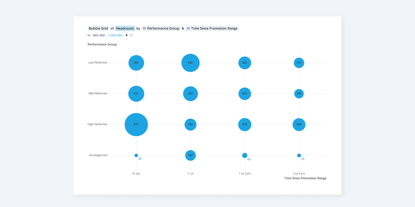
Headcount metrics are an essential element of people analytics. You can use this dashboard in a number of ways.
One example is looking at the evolution of the headcount over time. On one side, look at how the numbers are looking during a certain month. On the other, add the same numbers over the same month one year prior. This will give you an overview of the headcount changes in the last year, helping you identify positive or negative trends.
You may also choose to look at things like employee composition to see how many full-time (FTE), part-time employees, and contract employees are on staff. You can even drill into headcount by employee performance and time since promotion to identify high performers to consider promoting.
2. Employee turnover
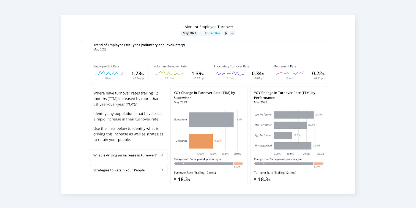
Employee turnover or attrition is one of the most analyzed HR metrics out there. There’s a good reason. When someone leaves the company unexpectedly, it can cost you a lot of money and time.
Employee turnover dashboards can show how many employees have left the company during a certain period. Similar to headcount, you can run a comparison between the numbers during the past month and those of the same period one year prior. All this can help you spot negative trends and show you potential ways to address them.
3. Diversity, equity, inclusion, and belonging (DEIB)
Companies that prioritize diversity and inclusion have better engagement among employees. We know engaged employees perform better, so DEI can be a crucial component of your company’s success.
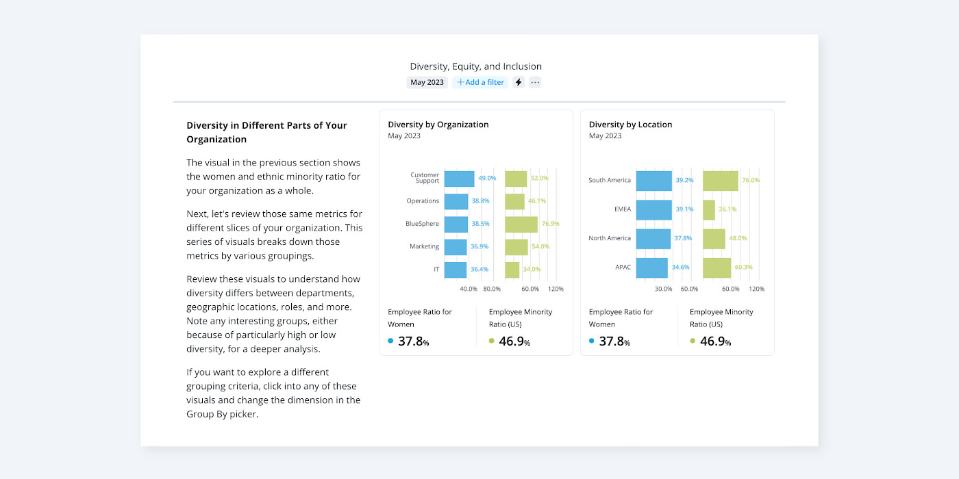
A diversity dashboard will usually contain many of the metrics previously discussed. This time, however, the data will be divided based on different criteria. You’ll be able to see turnover rates for different genders, races, or ethnicities. For instance, look at promotion metrics. Does everyone have equal opportunities or is one gender getting all the promotions?
You can also compare the data at different points in time to see if your DE&I efforts are yielding the results you were hoping for.
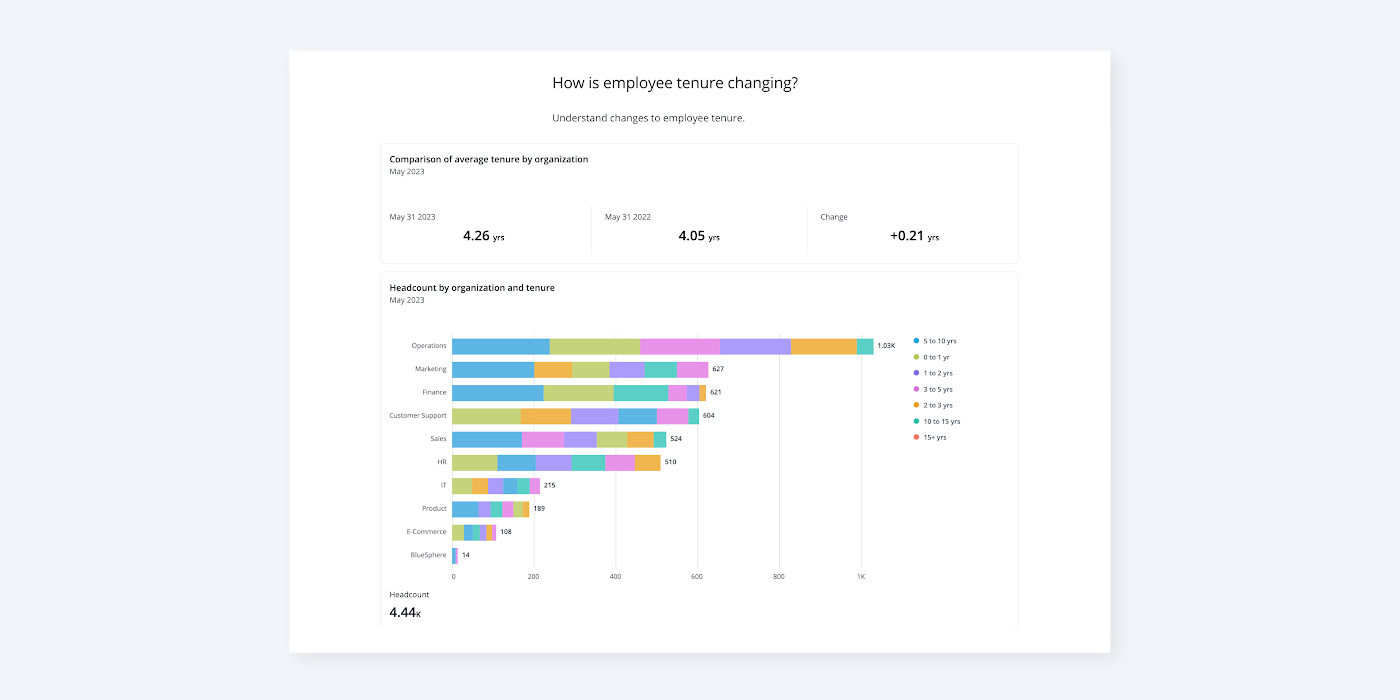
4. Employee tenure
Employee tenure is another useful metric when you want to understand talent flow. It shows you how long an employee has been with the company.
An employee tenure dashboard can show you things like tenure across various departments and positions, or the total workforce accumulated tenure in years. It can help you better understand turnover rates and is a useful tool in internal mobility and succession planning programs.
A people analytics dashboard is a great way to get a quick view of your people data and various HR metrics. It is a dynamic, interactive visualization tool that can help the HR department, managers, and employees better understand what’s happening inside the company. Used on its own or alongside reports, a dashboard will boost your understanding of your workforce, helping you make data-driven decisions and reach your business goals.
5. Talent flow
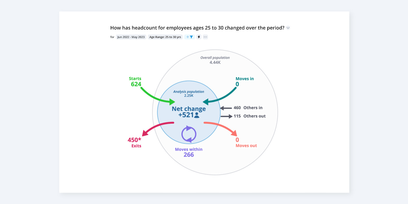
Employee turnover is a critical metric, but not the only one that matters. External and internal hires, successions, and upward and lateral movement within the company are all equally important. A talent flow dashboard can help you keep track of all this data and show you important patterns along the way.
You’ll be able to see how many new external hires you’ve had over a certain period and compare it to the same period in previous years. You can also look at internal hires. How many people are promoting? How is the headcount of specific groups or demographics moving within and outside of the business? How many are reskilling and moving to a different position at the same level?
All this will assist you in optimizing your talent acquisition and development plans. You’ll be able to allocate the budget more effectively and create the right programs for the right employees.
6. Span of control
Leaders can make or break teams. But no matter how good a leader is, if their team is too big or difficult to lead, they could fail. The span of control dashboard gives you an overview of how leadership is structured within the company and how many subordinates each person has.
You can view things like managerial structure, team size, and workforce distribution, or manager performance. With a span of control dashboard, you can optimize the management structure in your company, improve communication, and ultimately increase performance and productivity.

7. Promotions and career development
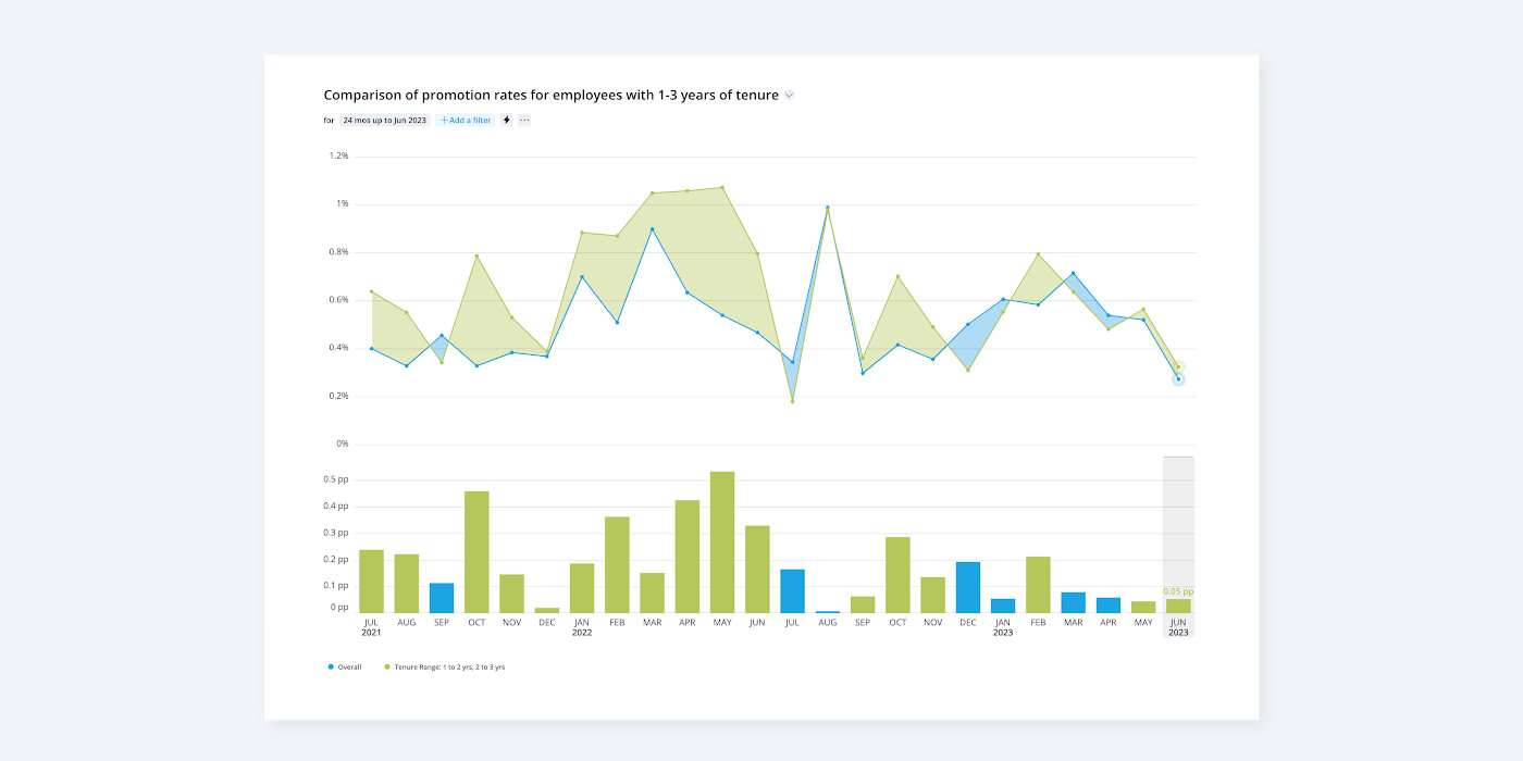
Once you understand your headcount and the movement inside the company, it is time to look closer at promotions. The talent flow dashboard may have already given you an insight into metrics related to promotions. With the previous dashboard, whenever you analyze data promotions, you do so in the context of both internal and external mobility.
You can use the career development dashboard to track the journey of your employees, as well as the success of your learning and development programs. You may also include data on skills and other information that will later assist you with succession planning.
A promotions dashboard is useful to both management and employees. Management can see the upward movement within the company, what skills employees start with, and what they learn along the way. Employees can better understand existing opportunities for growth and work towards their goals.
On the Outsmart blog, we write about workforce-related topics like what makes a good manager, how to reduce employee turnover, and reskilling employees. We also report on trending topics like ESG and EU CSRD requirements and preparing for a recession, and advise on HR best practices like how to create a strategic compensation strategy, metrics every CHRO should track, and connecting people data to business data. But if you really want to know the bread and butter of Visier, read our post about the benefits of people analytics.

Get Outsmart content straight to your inbox
Subscribe to the People Insights Monthly newsletter for actionable insights and stories.
Subscribe now